Case study 01 · Own project
Skissblocket
How can a portfolio show how I think, not just what I have done, and still feel like mine?
- My role
- UX/UI design, design system and interactive prototype
- Team
- Me, with Claude as a sounding board and coding help, and Gemini for Deep Research
- Time
- September 2026
- Tools
- Design canvas, HTML, CSS and JavaScript
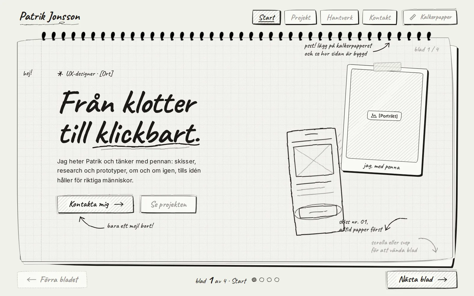
Who, what and why
discovery: before a single pixel was drawn
Who the site is for
The recruiter or UX lead
Goes through many portfolios in a short time, on a computer or phone
- Goal
- Quickly understand how I think and whether I fit the team
- Frustration
- Portfolios that all look the same and only show polished final images
The problem
How do I show process and craft without the portfolio becoming just another template?
- Goal
- Get in touch with recruiters and find an internship or freelance work
- Constraints
- No client projects yet, only paper and graphite in the interface, and everything has to work from 320 px
The trend is towards portfolios that show the thinking, not just the final images → every project gets a case study about who, why and how
Craft builds trust: typography, tokens, accessibility → an own design system and a Craft sheet
Notes and a memorable detail set it apart from template sites → margin notes and the tracing paper
How I got there
seven versions, each with one clear change
- 1
Discover
Reviewed trends in UX portfolios and found five recurring parts.
- 2
Define
Wrote the brief: a monochrome sketchbook of paper and graphite, where only the project images have colour.
- 3
Sketch
Built the SkissArt design system: tokens, three wobbly corner shapes, hard shadows and eight components.
- 4
Prototype
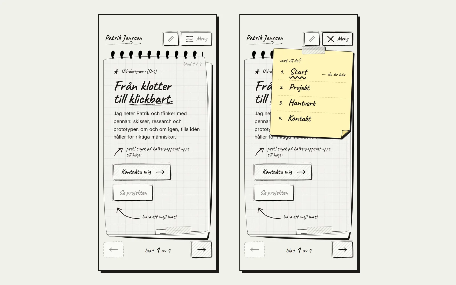
Interactive prototype in three sizes, with page turning, tracing paper and a sticky-note menu.
- 5
Test
Stress test with 3–4 times longer text at nine widths, contrast measurements and my own review.
Design decisions, and why
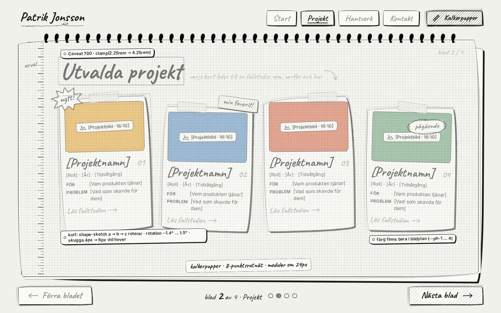
every number in the image has a reason
 123
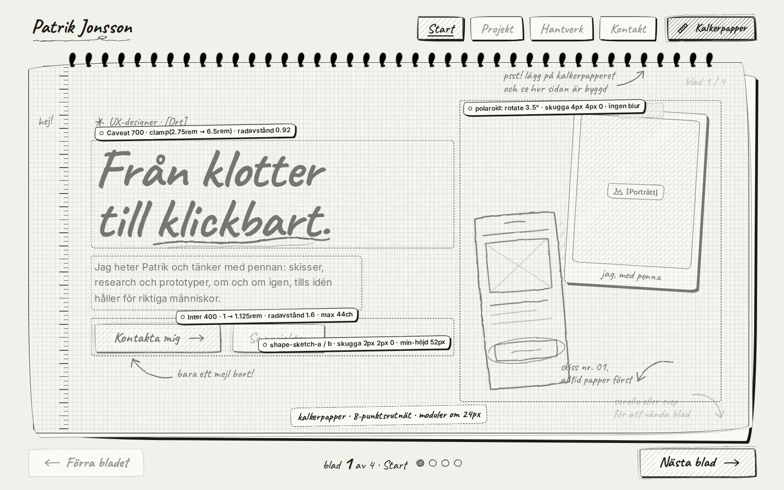
123Sheets that turn, not one long scrolling page
- Because
- A sketchbook is a collection of pages. Each section becomes its own sheet with room to breathe. The sheet only turns once you have finished reading, once per gesture.
- Rejected
- An ordinary scrolling page: quicker to build, but it feels like all the others.
The tracing paper as a signature move
- Because
- Craft shows best when you can see how the page is built: typefaces, measurements and grid, right on the design. The button has since moved onto the accessibility note, with a margin note pointing to it and a shortcut on the Craft sheet.
- Rejected
- Spec labels that are always visible. I tried it, and they stole focus from the content.
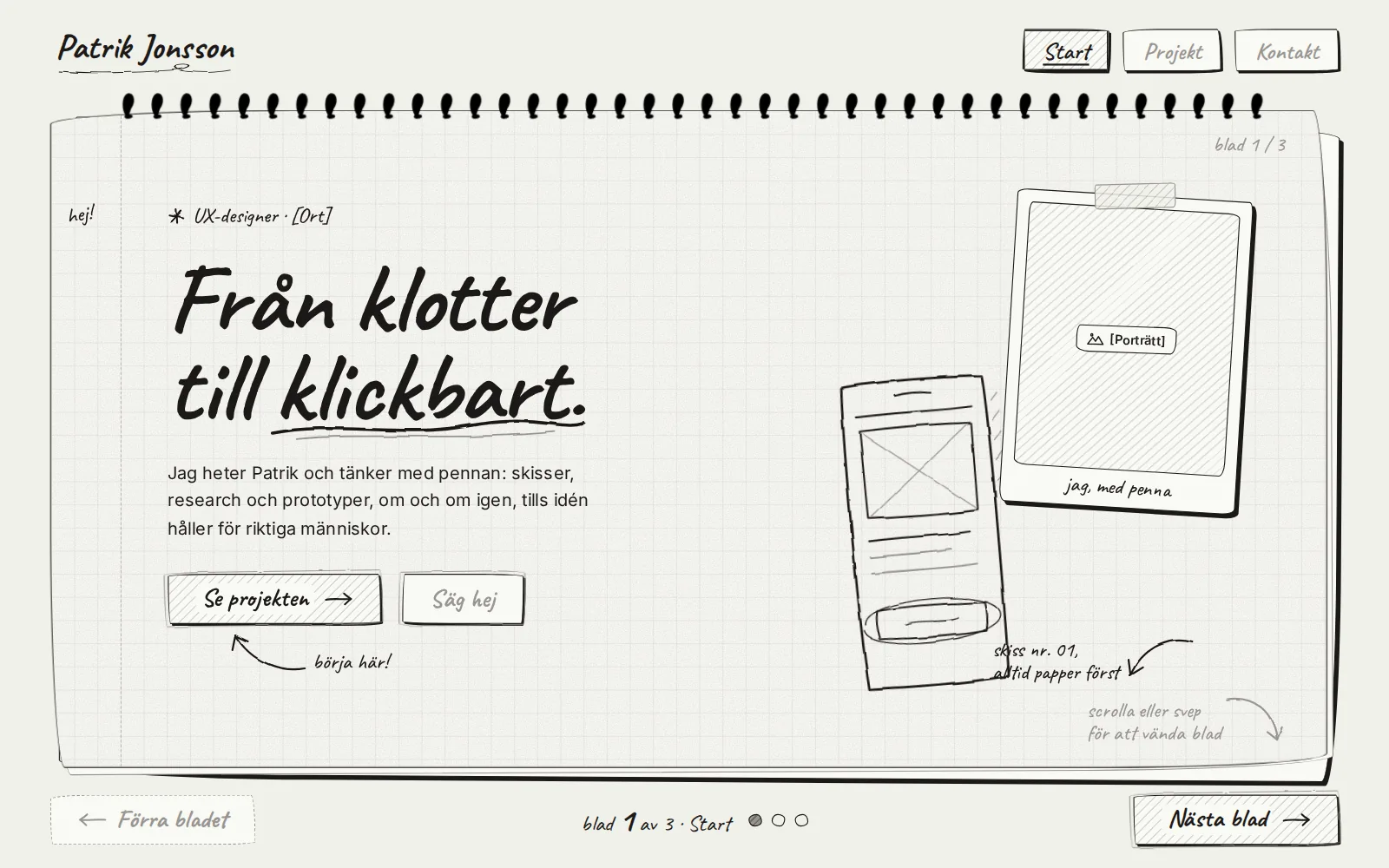
“Contact me” as the primary button
- Because
- The goal of the site is for someone to get in touch. The projects are still reached through a button, a tab and page turning.
- Rejected
- “See the projects” as primary, with a vague “Say hi” as the second choice.
The craft in the project
so that it holds up as it grows
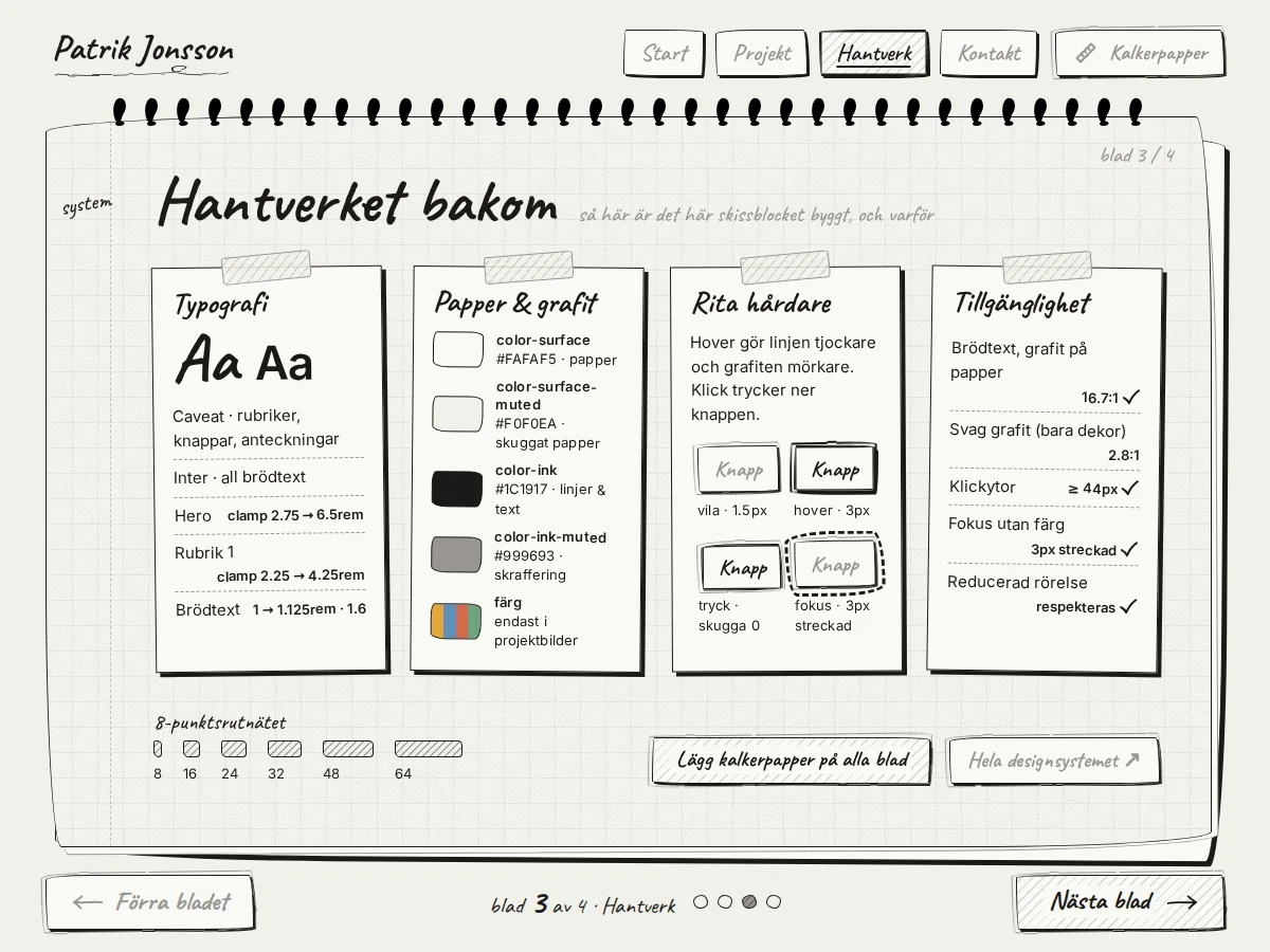
The SkissArt design system
Accessibility
- Body text 16.7:1 against the paper, menu text on the sticky note 15.7:1
- Focus without colour: a thick, dashed pencil line with some distance
- Touch targets at least 44 px, menu items 50 px
- Reduced motion: the sheets change without animation
- A deliberate compromise: light graphite (2.8:1) only for decoration and resting button text, never for body text
Mobile and edge cases
When the tabs didn't fit, the menu became a sticky note. The yellow tone is the only colour outside the images and is an explicit exception in the design system.
Safe areas for the status bar and home indicator, dynamic height, and swipes that leave the phone's own gestures alone.
Results & lessons
measure what matters
What I learned
Test with text that is too long, early. The stress test found bugs that short placeholders had hidden: a long email address caused sideways scrolling on mobile, and the sheet buttons ended up off screen on narrow phones.
Next step
Test with real recruiters. Everything so far is based on reviews and my own tests, not on user testing.
“This should be removed, as it steals focus from everything else.”