Case study 02 · School project, individual
Dunderkuren VC
How can an unsure senior choose the right type of visit, in person, video or phone, without having to guess?
- My role
- UX/UI design, from paper sketch to clickable prototype
- Team
- Individual assignment
- Time
- Spring 2026
- Tools
- Paper and pencil, Figma with an accessibility plugin
Who, what and why
discovery: who gets stuck, and where
Who the flow is for
The unsure senior
Often needs care, but feels insecure in digital interfaces
- Goal
- End up in the right place straight away, with clear confirmations in the critical steps
- Frustration
- Difficult terms like video call and phone advice, and the fear of choosing wrong
The problem
The patient lacks the medical knowledge to know which type of visit fits, and is forced to guess.
- Goal
- Fewer wrong bookings for the clinic and more confidence for the patient
- Constraints
- Only the core flow. Log-in, choosing a time and booking confirmation were left out
A 70-year-old has a mental model of the doctor's visit: you say hello and describe the problem → the flow starts as a conversation, not as a form
The wrong type of visit takes costly time, e.g. an in-person visit for eczema that could have been seen on video → the system recommends, so the patient doesn't have to guess
Someone who feels insecure may skip care altogether → language becomes a design tool: no jargon and at most three choices per view
How I got there
from paper to clickable prototype, one level at a time
- 1
Analyse
Went through the case and found the pain points for a senior. Set goals, requirements and clear constraints.
- 2
Sketch
Research of 1177 and other clinics. Paper sketches of different ways to guide step by step.
- 3
Structure
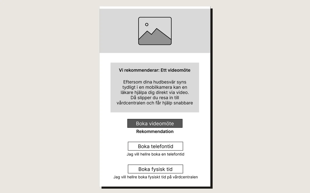
Wireframes in Figma that locked the flow, the copy and the hierarchy, with a failure path for when something goes wrong.
- 4
Systematise
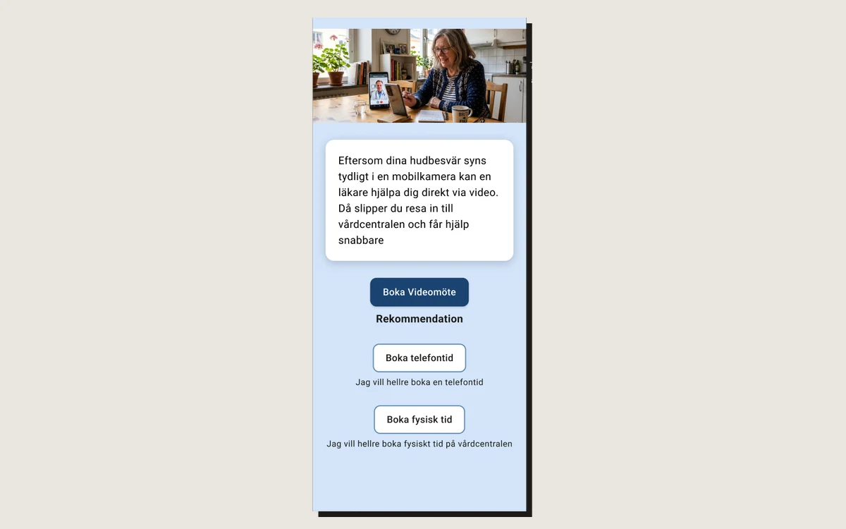
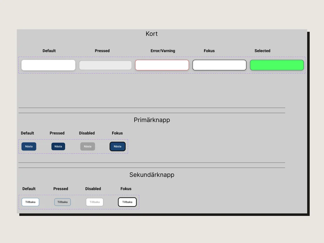
A design system with tokens and components, checked against WCAG AA. Mockups with clear states.
- 5
Prototype
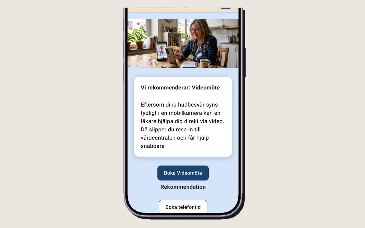
A clickable hi-fi prototype with variables and logic that simulate the recommendation.
Design decisions, and why
every number in the image has a reason
 123
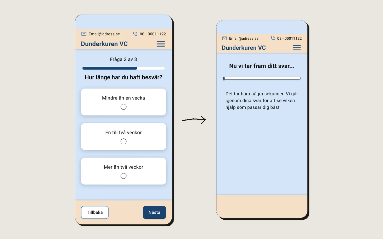
123One question at a time
- Because
- A closed, conversation-like path keeps the amount of information down, like at the doctor. Broad questions first rule out acute conditions, then the funnel narrows.
- Rejected
- Lists and categories the patient has to search through.
Large touch targets over a clean look
- Because
- Many seniors see and move less well. The buttons look the same and sit in the same place throughout the flow, so they are recognised.
- Rejected
- A smaller, airier interface that would have looked more modern.
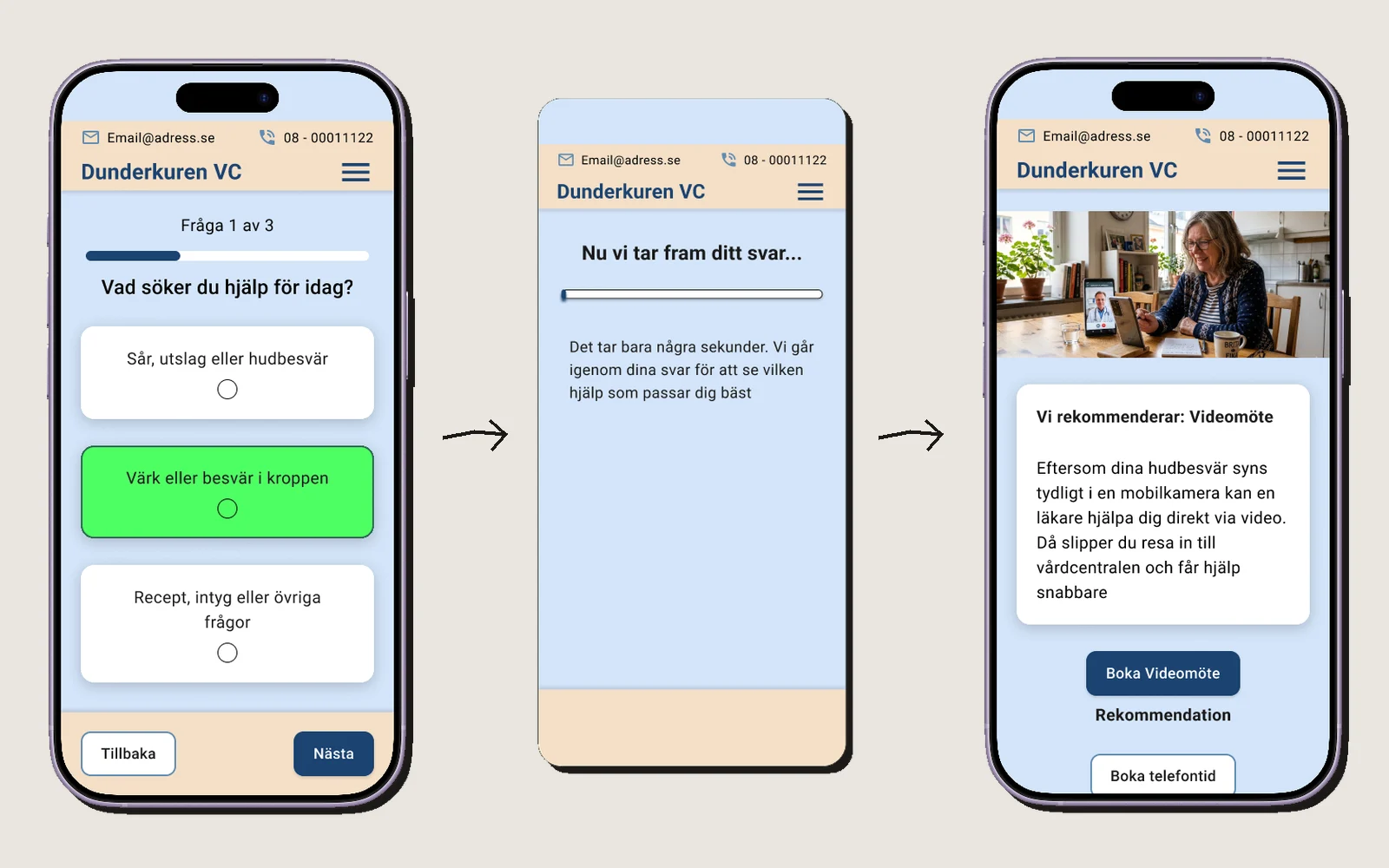
A short pause before the answer
- Because
- A waiting screen with a loading bar and the text “It only takes a few seconds…” shows that the system has made a careful assessment. An instant answer can feel unserious.
- Rejected
- Showing the recommendation straight away.
The craft in the project
safe for someone who is unsure
Design system and prototype
Accessibility
- Contrast and touch targets checked against WCAG AA with a Figma plugin
- Everyday language, no medical or technical jargon
- The status line “Question 1 of 3” always shows where you are in the flow
- The answer cards have their own states for press, focus, error and selected, so a choice shows straight away
- The error message says what to do: “Please choose an option to continue”
Failure path and handoff
The recommendation is the primary button, labelled “Recommendation”. If the patient still wants something else, a phone call and an in-person visit remain as secondary buttons, with a line that explains the choice: “I’d rather book a phone call”.
For the developer there is a separate page in Figma with the key design decisions, risks, dependencies and next steps.
Results & lessons
ready for testing, not tested yet
What I learned
Leaving things out is design too. Without log-in, choosing a time and confirmation, I could spend all my time on what actually reduces wrong bookings: the hierarchy and the words.
Next step
Test with real seniors. The prototype is built for it but has not been user tested yet, so everything here is based on research and my own review.
“Welcome! I’ll ask you a few questions now, and then I’ll tell you how we’ll go on.”